
In undoubted proof that you are never too old to learn, I have. Learned, that is…the old just comes with the territory.
Shooting my scale model reports for this column, I follow a regular pattern. An introduction with the kit’s box, instructions, sprue trees, and decal sheet, then a number of building stages, then a reveal of the final thing. This last post has 5 or 6 images of the model shot from specific angles. Each reveal echoes the rest and is part of my archives for the Air World or Armour World collections.
The choice of backdrops for the photos is dictated in the early stags by the colour of the plastic in which the kit is moulded. Grey is common, though green, black, and white have been seen. I’ve got a red biplane unbuilt and there were the startling colour combinations of some Matchbox kits. A good backdrop contrasts to the plastic and adds interest.
However, I made a mistake for a long time in my choice of backdrops for the reveal stage – I carried on with the bright colours or put a white or back sheet of paper on the set. In some cases I printed out an elaborate back scene and a base that looked like a concrete hardstand. All artistic and that, but I did the models no favours by so doing.
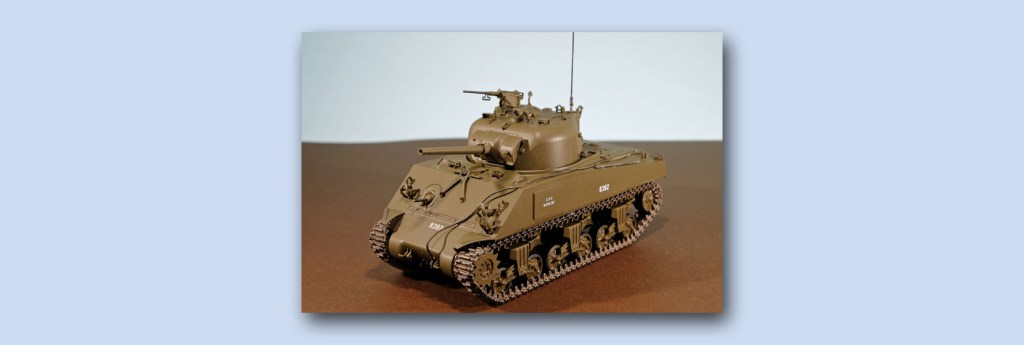
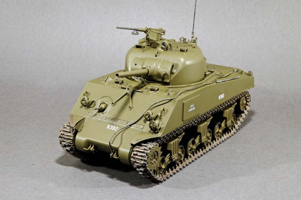
The multi-colours influenced the reflected light on the model and if I wasn’t wise, threw off the paint scheme entirely. Look at this rendition of the Sherman tank and compare it to the heading picture. The heading shows the correct olive drab – the two-tone makes it look brown.
Think about it – all the fuss I make about the exact colour for the paint and I throw any accuracy away at the end…
So from here on in, the reveal shots are to be taken with a standard dark grey textured paper from Jacksons Art Supplies. It probably has a Pantone number but I don’t know it – all I can say is that it removes the bias from the shot and makes the model look better.

Leave a comment