

Or into, as the case may be. A pot of paint. 10 ml of potential heaven or hell. A liquid mistake waiting for you to make it.
I am a 10ml paint pot guy – Tamiya, GSI Creos, or AK Real Colours are the ones that sit in my paint rack. I’ve experimented with others, judged them, and have decided that my needs can best be met by these three makers. That should be the end of the tale. But no…
I needed a dark blue for the US Navy 1945 Helldiver. The Sword Models instructions called for Navy Blue, the box art showed something closer to Midnight Blue. As I also had the choice of Dark Blue and Royal Blue I was in a quandary ( Lovely car, the Quandary. ). How blue is blue?
Opening the pots and peering in ( the title…) was little help. They all looked the same – dark blue. Leaving me to the old task – smear some of each colour on a grey card and compare them after drying. And I’ve long since learned in the photo trade to do my comparisons outside in direct sunlight – interior lights of dubious Kelvin number can throw off the best of eyes. Ol’ Sol delivers the same thing each clear day.
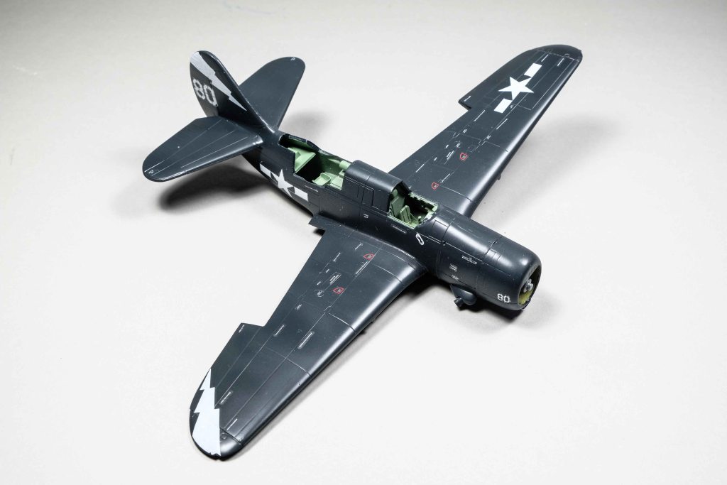
The deep blue-grey is not the same shade as the box art – but bears the same FS number as the instructions call for, so I am going to regard that as sufficient authority. The Midnight Blue can be reserved for post-’45 jets.
Note to self: You can have one of two things – stencils on your 1:72 aircraft or eyesight into your old age. I plan to put them on everything and use a white stick.

Leave a comment