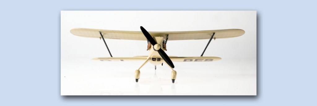
I have chosen this title as a nod to the paint scheme on this Heinkel. I am pretending it was a civilian aircraft.
Anyone familiar with the history of Germany at the time this was flying – mid thirties – can draw their own conclusions about what was a civil aircraft and what was a belligerent one. In this case there are several extant photos of this type painted in this way.
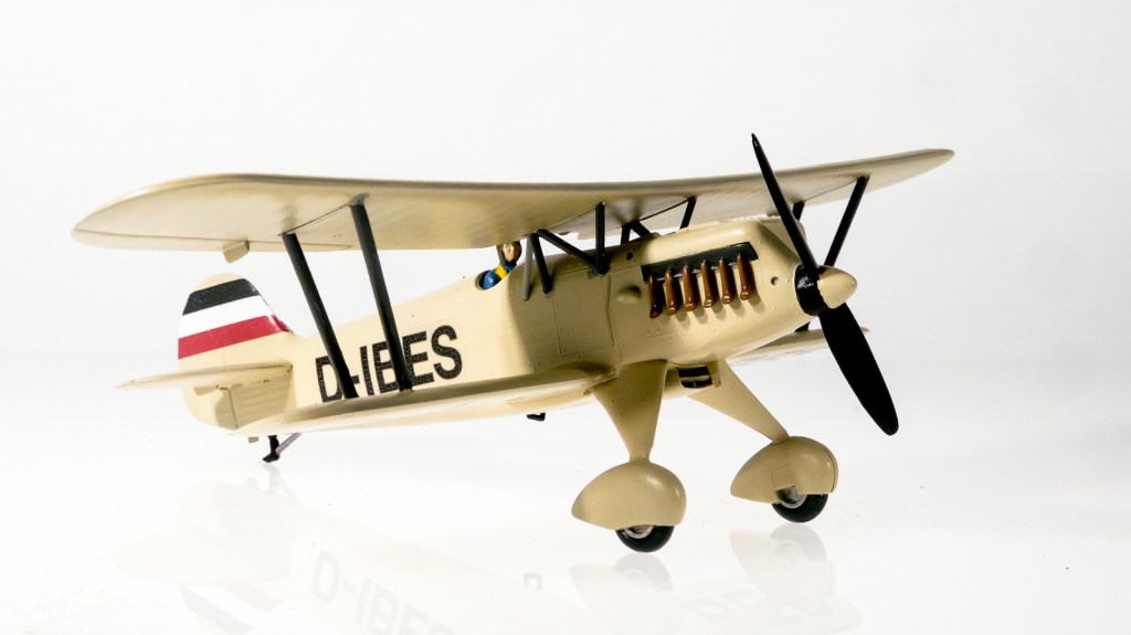
The decals, of course, are home-made – but while the lettering for the wings and fuselage came out superbly, I realized too late that I had made a mistake with the tail colours – I’d printed them on the same clear-based decal film upon which the black lettering lay. Once applied, they would have let the light sail colour be seen instead of a central white.

Well, I decided to underlay the tail with a pure white…there was plenty on scrap pieces of decal paper. After the paint job was finished and hard, I coated the decal areas with a gloss spray and set about banding the tail.
This was when I discovered that raw white decal film is magnificently thin, but nearly impossible to work with. It is hard to get off the backing paper and then stretches and distorts as you try to put it on. It exudes sticky glue. In the end I decided to cut the anchor and sail away – I printed a fresh red/white/black tail band on the white paper and went through the standard procedure of letting it dry and then coating it with a semi-matte varnish spray.
After that it was perfectly workable and lay on the tail without any drama whatsoever. The lettering gave no problem at all. It is amazing just how clear and docile the decal film is when you are just putting on registration letters. A nearly-dry brush is excellent for the final smoothing – in the line of the air flow, of course.
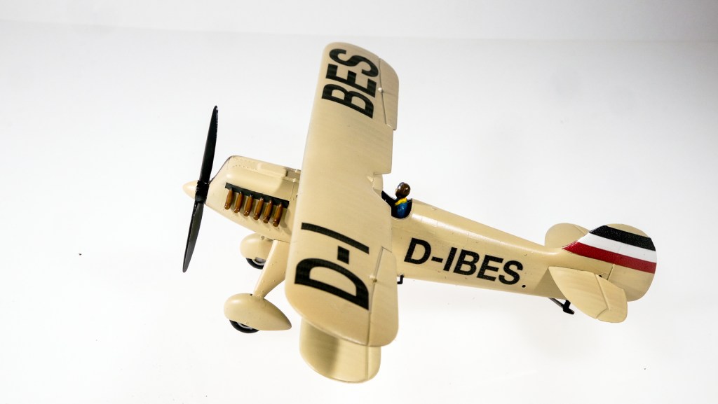
The wing fit for this Hasegawa kit was nearly spot-perfect. I should commence another of their biplanes whenever it was offered.
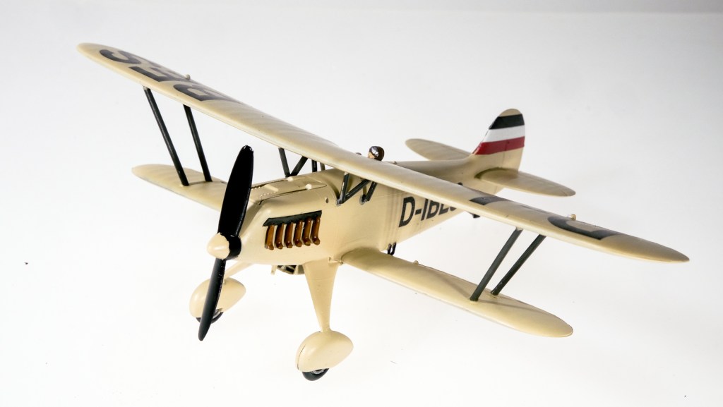
Regular readers of this column may note the new photographic platform being used for the model. There is a controversy in the Little Studio at present about whether dark grey or bright white backdrops should be used – you may see several varieties in coming months. The task of eliminating shadows while still giving full saturation to the paint schemes is one of delicate balancing – and the photographic white balance is always a high-wire act at the best of times.

Leave a comment